
Exploring the Power of Color in Cardmaking with Altenew
Color is one of the most powerful tools in a cardmaker’s toolbox. It can set the mood, evoke emotion, and bring your creative vision to life with just a single shade. In this blog post, I’m excited to take you on a vibrant journey through the rainbow—one handmade card at a time! Each project showcases a specific color, along with its unique emotional energy, utilizing some of my favorite Altenew supplies and a range of coloring techniques. From bold reds that express love and energy, to calming blues that soothe the soul, each card tells a color story of its own.
Whether I’m blending crisp Altenew inks, watercoloring with their Artist Watercolor Pan Set, or layering bold die-cuts and stenciled backgrounds, I’ll be sharing how each color inspired the design and how it can impact the overall feel of your card. Ready to see how mood meets medium? Let’s dive into a colorful collection of creativity!
Card One: Radiant Red – A Burst of Energy and Passion
I began this colorful journey with red—a hue that instantly commands attention. Red is the color of passion, strength, and excitement. It’s bold, unapologetic, and full of life, making it the perfect choice for a card that celebrates love, motivation, or bold beginnings.
For this project, I reached for one of my favorite Altenew floral stamp and die sets, Dazzling Flowers: Cineraria, a perfect match for red’s romantic and powerful nature. I stamped the image with Permanent Black Ink onto watercolor cardstock and brought it to life using the Altenew inks Crimson, Velvet, Heartbeat, Eucalyptus, Forest Fern, and Berry Mocha. I focused on the rich crimson and scarlet tones. I layered the petals with reds and a hint of a deep red in the shadows to give the flower dramatic depth and movement.
The sentiment, “You Inspire Me,” from the Label Love stamp set, was stamped in Heartbeat on a white cardstock for a striking contrast.
This card is bold, expressive, and full of heart—just like the color red. Whether you’re celebrating a friend’s success, sending love, or simply want to lift someone’s spirits, red brings the fire and flair to make your message unforgettable.

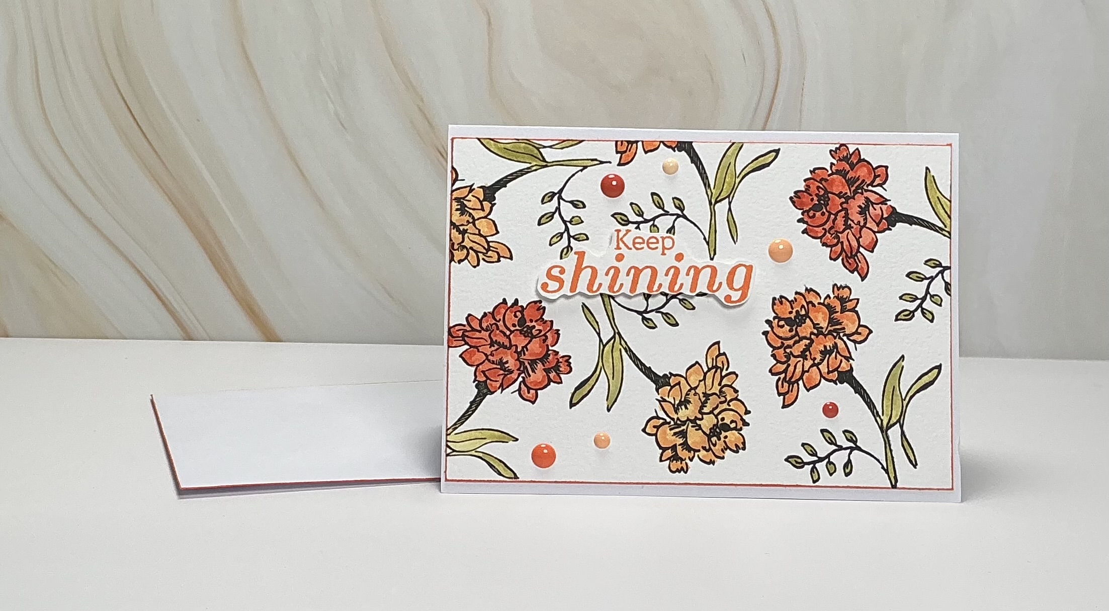
Card Two: Outstanding Orange – A Symbol of Health and Courage
Next in our color journey is orange—a warm, uplifting hue that radiates vitality, creativity, and confidence. Orange often symbolizes health, encouragement, and bravery, making it a wonderful choice for cards meant to uplift and inspire. Its vibrant glow feels like a gentle sunrise, reminding us to keep going and keep growing.
For this card, I used the One of a Kind stamp set as the background focal point. Stamped onto watercolor paper, it offered just the right amount of texture for an organic, artistic look. I used the ink-watercolor technique with Altenew dye inks—Orange Cream, Sunkissed, Firebrick, and Marshland—to create a radiant burst of blended color. The result was a bold, sun-washed background with pops of warm depth and earthy undertones.
The sentiment “Keep Shining” from the Sunny Sentiments stamp set was the perfect finishing touch. I popped it up with foam adhesive to create contrast and dimension. This simple, encouraging phrase shines brightly against the background, echoing the card’s warm and courageous tone.
To complete the design, I added a few Warm and Cozy Enamel Dots, strategically placed to guide the eye and tie in the orange palette. These little accents bring just the right amount of playful sparkle.
This orange-themed card feels like a warm hug and a pep talk all in one—perfect for cheering someone on, sending support, or reminding a friend of their strength.
Card Three: Hello, Yellow – A Burst of Energy and Cheer
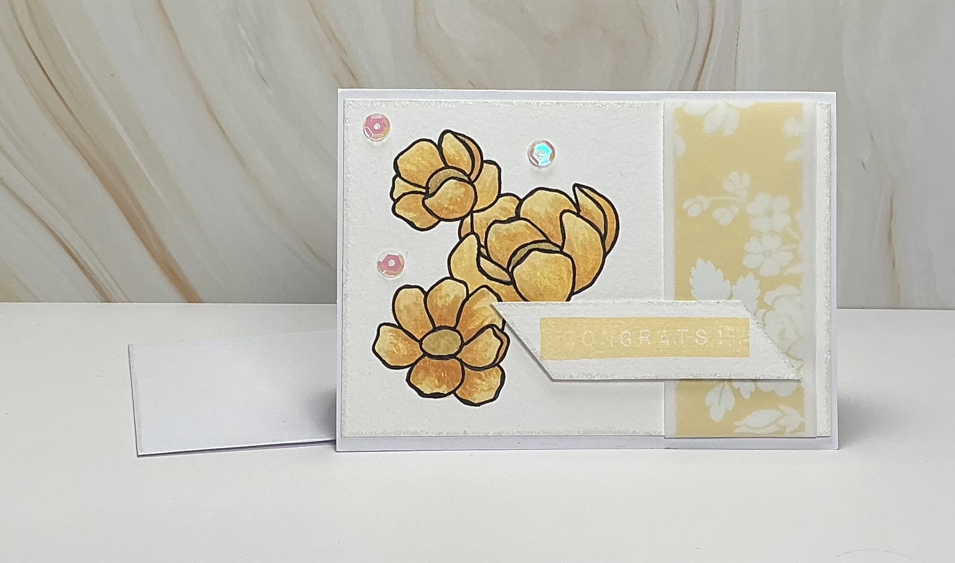
After the warmth of orange, we turn to the sunny side of the color wheel with yellow—a color that radiates joy, optimism, and light. Yellow is often associated with energy, creativity, and happiness. It’s like sending a little bit of sunshine through the mail, perfect for celebrating life’s bright moments.
For this cheerful card, I chose Altenew’s Enamel Flowers stamp set. The whimsical floral images were the perfect fit for a playful and vibrant yellow color palette. I began by stamping the flowers and using a combination of Altenew Vanilla Cream, Sunkissed, Mixed Media Ink in Buttercream, and Catherine Pooler’s Sauna in a watercolor technique. Layering these shades gave the petals depth while maintaining their sunny glow.
To add contrast and texture, I layered vellum over a piece of complementary patterned paper. This softened the background and gave the florals a floating, airy feel.
For the sentiment, I reached for the “Congrats” stamp from Altenew’s Label Love set. Stamped in yellow, it added a modern, graphic touch that balanced the softness of the vellum and floral elements.
A few shimmering sequins scattered across the card added the perfect bit of sparkle—like sunshine dancing on morning dew. They gave the whole piece a celebratory vibe, enhancing the feeling of joy and accomplishment.
This card is the embodiment of happiness in paper form—perfect for graduations, new jobs, or any milestone worth celebrating with a burst of cheer.
Card Four: Glorious Green – A Soothing Touch of Nature
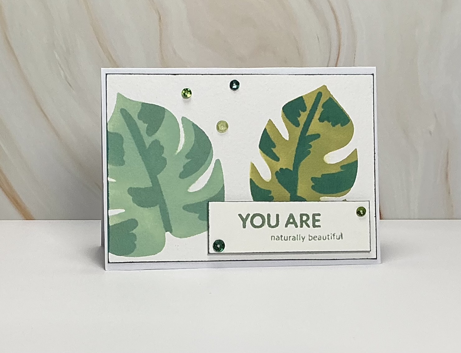
From the brightness of yellow, we move into the calming and grounded world of green—a color that speaks to renewal, tranquility, and growth. Green is soothing to the eye and soul, often associated with nature, healing, and balance. It’s a gentle reminder to pause, breathe, and reconnect.
For this card, I leaned into those natural vibes using Altenew’s Modern Monsteras Stencil on watercolor paper. The organic shape of the monstera leaves paired perfectly with a layered stamp technique to create a soft, flowing background. I blended several rich shades of green—Marshland, Jade, Eucalyptus, and Forest Fern—allowing the inks to layer for a dreamy, botanical effect.
To let the leafy background take center stage, I kept the layout simple and clean. The sentiment, “You are naturally beautiful,” from the Grown with Love stamp set, was stamped in a matching green ink to echo the theme of natural beauty and inner strength. The monochromatic sentiment blends harmoniously into the background while still standing out with intention.
The textured watercolor paper added just the right amount of organic feel, enhancing the earthy, grounded emotion behind the card. I resisted the urge to over-embellish, using only some sequins, letting the color and shapes do all the talking.
This green card feels like a breath of fresh air—perfect for sending encouragement, reminding someone of their natural beauty, or simply offering a peaceful moment in a busy day.
Card Five: Beautiful Blue – Calm, Cool, and Confident
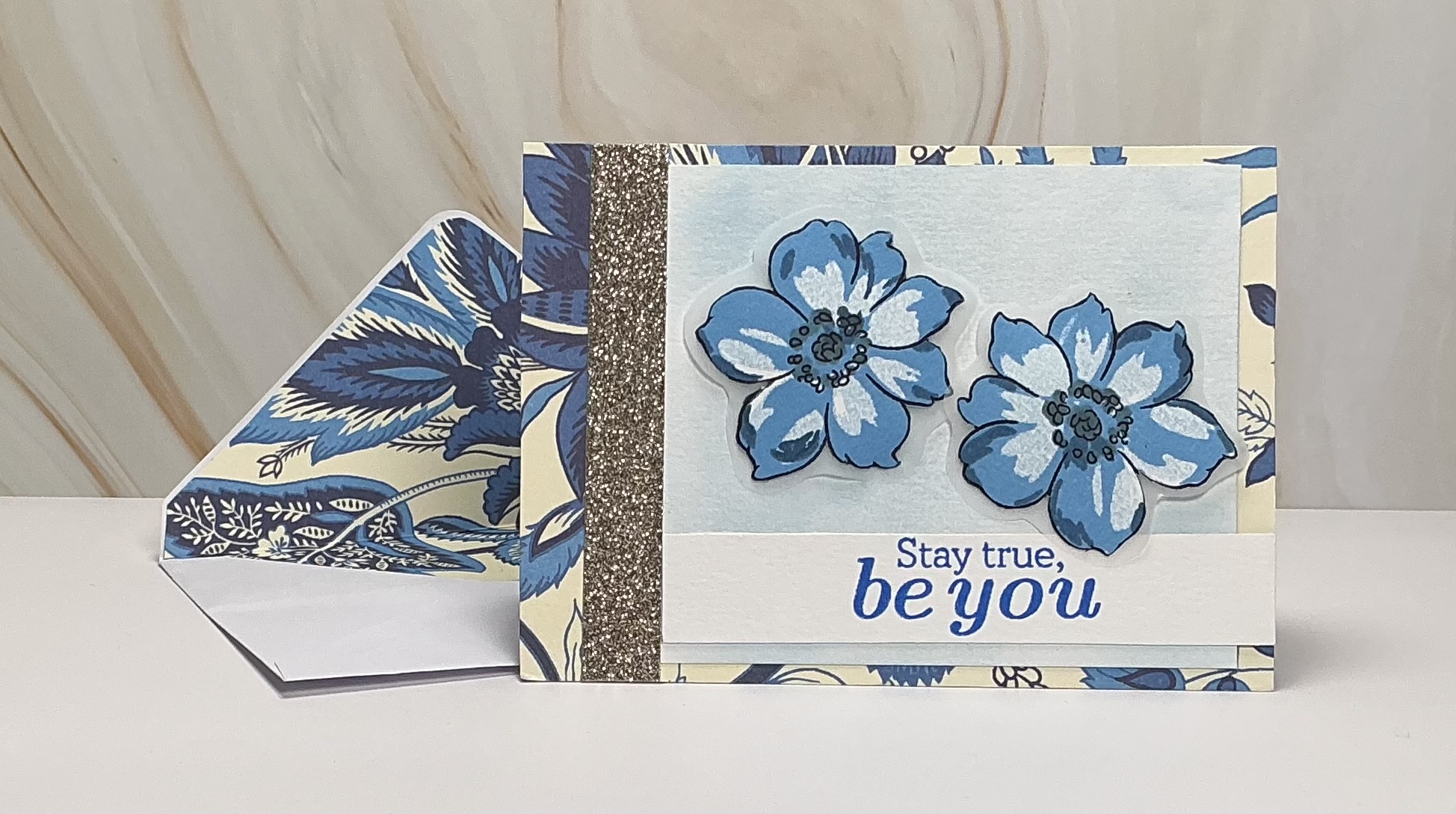
After exploring the grounding energy of green, we flow into the calm and tranquil world of blue. Often associated with peace, clarity, and reflection, blue has a quiet strength that brings serenity to any design. It’s a color that soothes the soul and speaks gently—perfect for messages of encouragement and authenticity.
For this card, I started with a soft, patterned paper base to create a subtle backdrop with texture and interest. Over that, I stamped Altenew’s Wispy Joy floral images onto watercolor paper that was brushed in a light blue ink, and backed them with vellum, where they could truly shine. Using Altenew inks in Nimbus, Eastern Sky, and Ultramarine, I created a soft gradient of blues across the petals through layering inks into a delicate wash of cool, calming tones.
The sentiment, “Stay True, Be You,” from the Sunny Sentiments set, was stamped in blue, complementing the florals while anchoring the card with its encouraging message. The deep blue ink gave the sentiment presence without overpowering the soft watercolor elements.
To add a touch of elegance and contrast, I included a narrow strip of Altenew’s Gilded Glitter Cardstock in Smoky Quartz. Its subtle shimmer gave the card a refined finish—just enough sparkle to catch the eye while maintaining the overall calm of the design.
This card is a gentle reminder to stay centered, stay kind, and stay yourself. Whether you’re lifting a friend’s spirits or simply sending a thoughtful hello, blue brings a calming, steady energy to any sentiment.
Card Six: Peaceful Purple – A Touch of Compassion and Creativity
We now arrive at purple—a color that blends the calm of blue and the energy of red to create a hue that feels both compassionate and uplifting. Purple often symbolizes imagination, wisdom, and kindness. It’s a color with depth and gentleness, making it a beautiful choice for cards meant to encourage, comfort, or inspire self-love.
For this heartfelt design, I used Altenew’s Mini Delight: Petite Posy stamp set to create a soft floral background on watercolor paper. The small, delicate blossoms were watercolored in layers using Pale Mauve, Razzleberry, and a hint of Misty Mint for the leaves. I also brought in Momento Ink in Elderberry to deepen some of the flower details, adding contrast and richness to the pastel palette.
The sentiment, “I hope you feel beautiful today,” from Altenew’s Build-A-Flower: Anemone set, was stamped in Razzleberry, echoing the florals and anchoring the message with warmth and sincerity. This phrase paired perfectly with the gentle purples—kind and encouraging, just like the color itself.
To add a bit of texture and shine, I scattered Altenew’s Sugar Plum Enamel Dots across the card front. Their glossy finish added a whimsical, playful detail without overpowering the soft watercolor look.
This card is a gentle hug in paper form—perfect for lifting someone’s spirits, celebrating quiet strength, or simply reminding someone how wonderful they truly are.

Card Seven: Pretty in Pink – Sensitive, Sweet, and Full of Heart
It only feels right to include pink—a color that exudes sweetness, sensitivity, and heartfelt emotion. Pink is often associated with love, kindness, and compassion, making it the perfect hue for cards that uplift, encourage, or simply say “I’m thinking of you.”
For this soft and cheerful card, I used Altenew’s Celebrate Layering Stamps to build a lovely floral scene on watercolor paper backed with patterned paper. The layers came to life with a dreamy blend of Pink Diamond, Pinkalicious, and Coral Bliss—a trio that offered both gentle lightness and rich pink tones. For the leaves, I used Jade, which added a cool contrast and grounded the warm pinks beautifully.
The sentiment, “I think you are Amazing,” from the Sunny Sentiments stamp set, felt just right for this card’s gentle tone. Stamped in a coordinating pink, it radiates positivity and warmth—like a kind word from a close friend.
To finish the design, I sprinkled a few sequins across the background. These little sparkles added a delicate shimmer and playful movement, echoing the soft and sweet feel of the color pink.
This card feels like a note tucked inside a bouquet—sincere, tender, and thoughtful. Whether it’s for a friend who needs a boost or a loved one just because, pink brings a sense of closeness and gentle joy that’s impossible to ignore.

Card Eight: Radiant Rainbow – A Celebration of Cheer and Optimism
What better way to conclude our colorful cardmaking journey than with a rainbow—a symbol of hope, joy, and new beginnings. Rainbows combine the emotional energy of every hue we’ve explored into one bright, cheerful spectrum. They remind us that beauty often follows the storm, and that there’s always something worth celebrating.
For this final card, I used Altenew’s Fireworks Stamp Set to create a festive, energetic background on watercolor paper. I blended Altenew inks in Buttercream Mixed Media Ink, Heartbeat, Forest Fern, and Ultramarine, letting each color radiate outward like a burst of light. The watercolor paper allowed the inks to flow and mingle softly, capturing the magical feel of a rainbow in motion.
I layered the stamped panel over a piece of green glitter cardstock, which added sparkle and dimension, perfectly echoing the celebratory tone of the card. The glitter backing catches the light and gives the design that extra dose of joy and movement.
The sentiment, a simple but powerful “celebrate” from the same Fireworks set, was stamped to remind us to embrace the happy moments—big or small.
This rainbow-inspired card is all about positivity, possibility, and pure delight. It’s perfect for birthdays, milestones, or just a spontaneous reminder that life is worth celebrating.

Final Thoughts
From the fiery reds to the calming blues, from soft pastels to vibrant rainbows, this journey through color has been such a rewarding creative adventure. Each hue brought its own emotion and personality, transforming our cards into mini reflections of love, encouragement, joy, and strength.
I hope this color series has inspired you to think more intentionally about how you use color in your own cardmaking. Whether you’re reaching for bold tones or soft shades, remember: every card you create tells a story—and color is one of your most powerful storytellers.
Thanks for following along! Let me know in the comments which color inspired you most—or share your own rainbow creation. Keep creating, keep celebrating, and above all, stay colorful! 🌈
